Slammit - Whisky Label Redesign
THE OPPORTUNITY
Conor Gough of Slammit Whisky Inc. (NYC) approached me to elevate their brand - a flavored whisky inspired by the popular “green tea shot.” While the product was unique, the original design felt childish and didn’t reflect the quality expected on shelves.
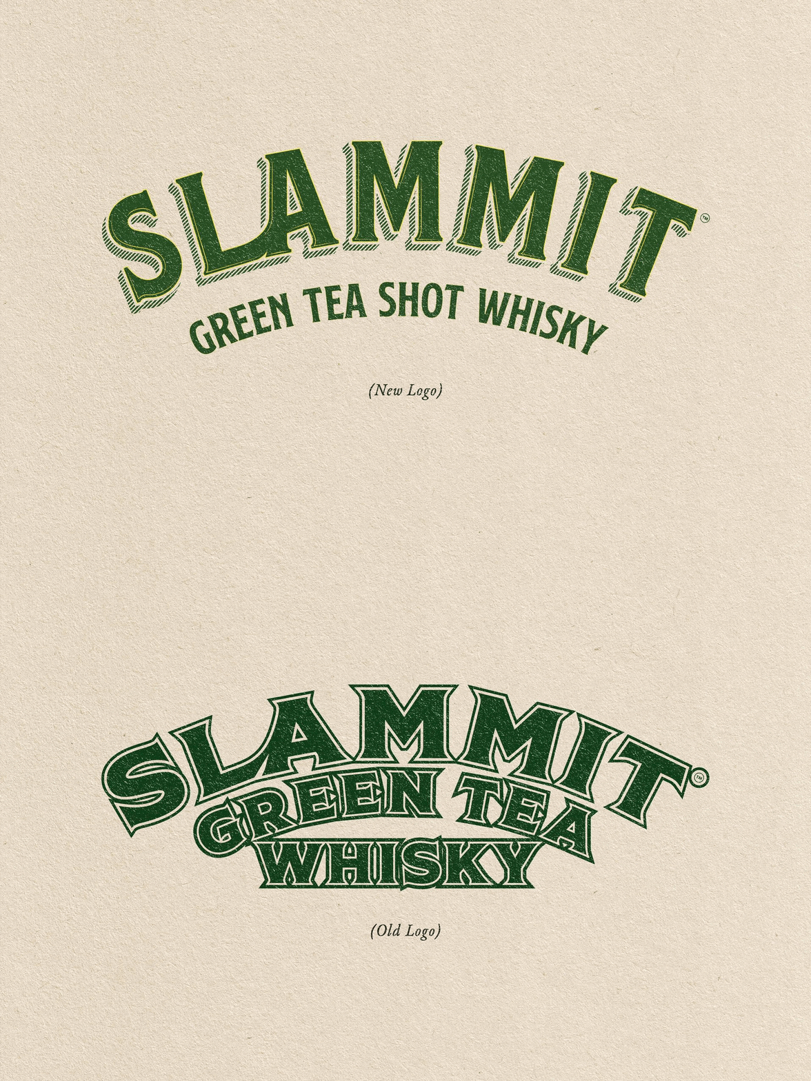
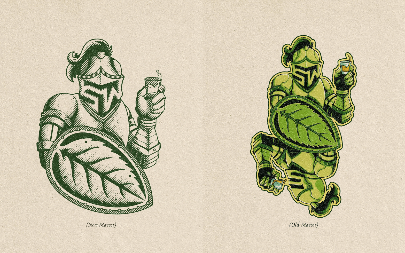
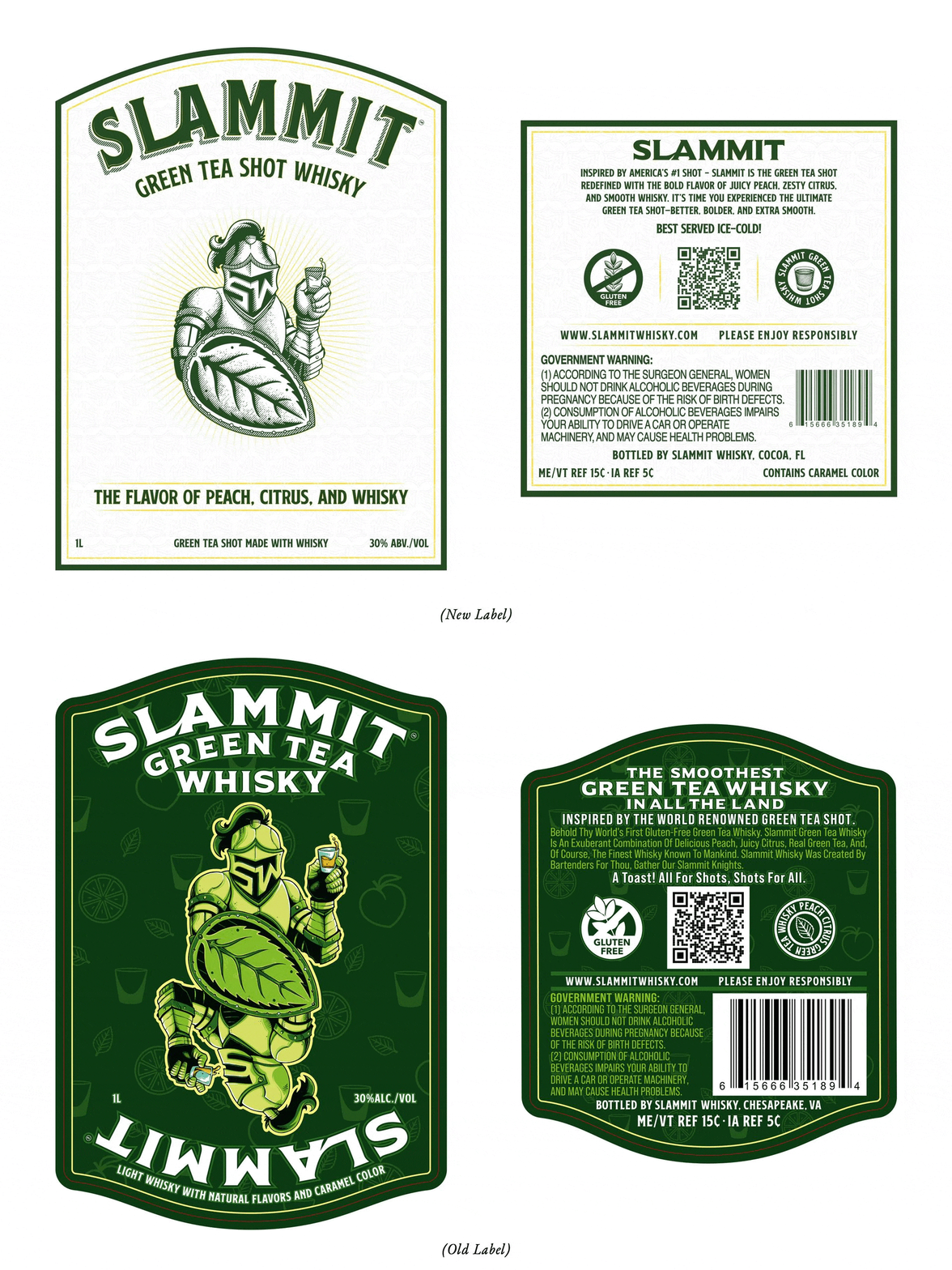
I was tasked with redesigning the front, back, and neck labels, refining the logo, and recreating the mascot illustration. The brief was to give the brand a more premium, slightly vintage look. The original assets needed key improvements, including vectorizing the mascot and polishing the logo. The goal was to create a more sophisticated identity that could hold its own alongside major whisky brands.
THE SOLUTION
Working directly with Conor, we broke the project into key phases to align with the new vision. We began by refining the logo - improving structure, balance, and legibility for a more premium, confident look. I then re-illustrated the mascot, correcting symmetry issues and delivering a clean, scalable vector while preserving its playful tone.
Next came the label redesign. I revamped the front, back, and neck layouts with better hierarchy, typography, and composition. We refined copy placement and tone, and I created custom icons to support the brand story.
The result: a bolder, more polished identity that balances Slammit’s playful energy with a premium, slightly vintage feel built for stronger shelf appeal.
Featured on Behance - Behance Graphic Design Category 2025
Client: Slammit Whisky Inc.
Services: Logo Design, Illustration & Label Design
Photos: Slammit Whisky Inc.
Year: 2024


